Luminar · An accessible experience for elderly care
My role: UX/UI and interaction design, with accessibility research and build handoff.
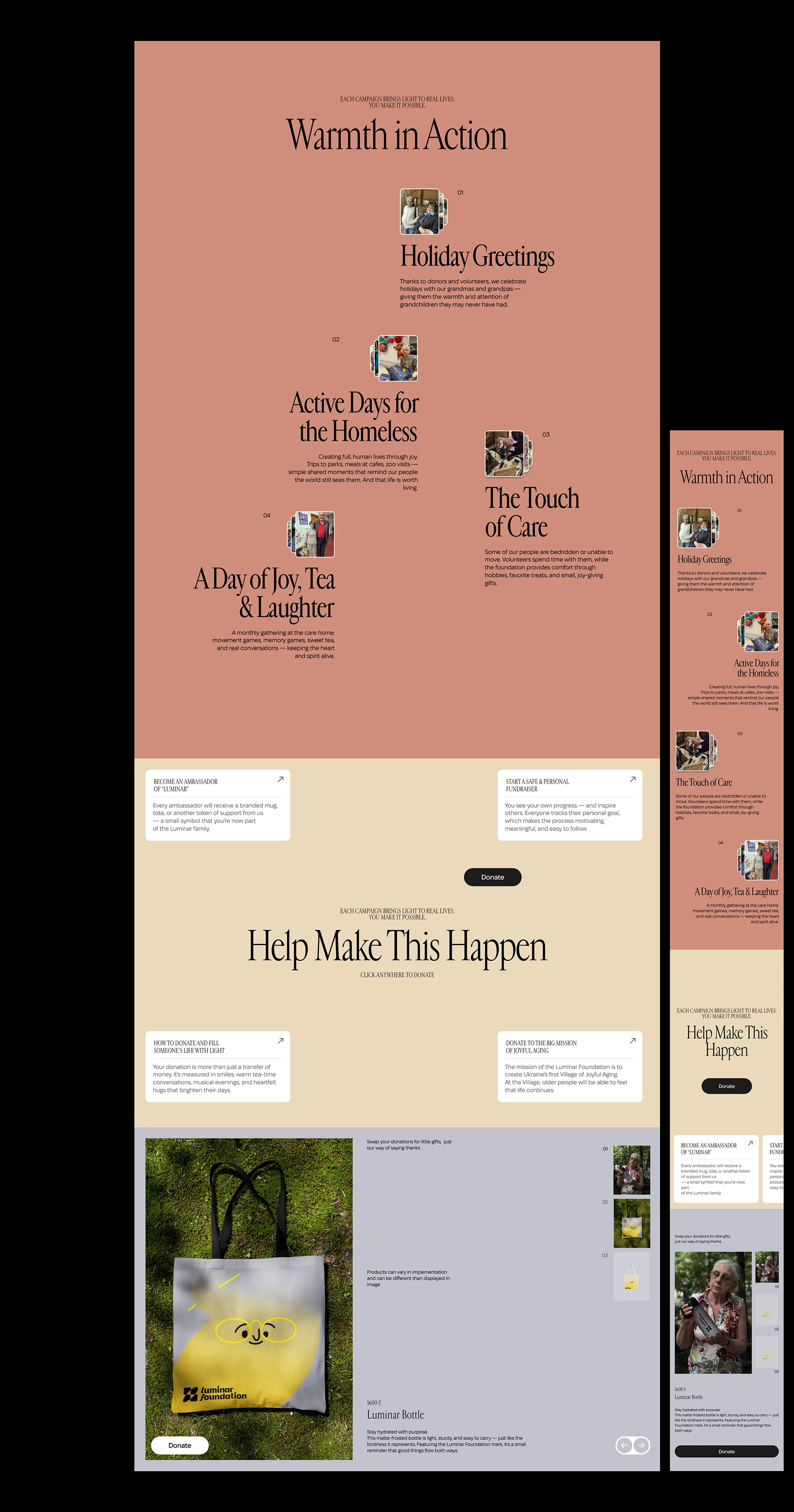
Luminar is a foundation that supports elderly care. Its audience splits two ways: frail older users, and the families and donors who act on their behalf. The experience had to be legible and reassuring first, expressive second.
Research
Accessibility set the constraints before aesthetics did. Older users mean lower contrast sensitivity, larger touch targets, simpler paths, and caution with motion that can disorient. Donors and family mean a different job: they need fast proof that their help does something real.
So I designed for two reading levels at once: a calm, legible surface anyone can use, and a clear answer to the donor’s question, where does my help go?
Designing the experience
Legibility first
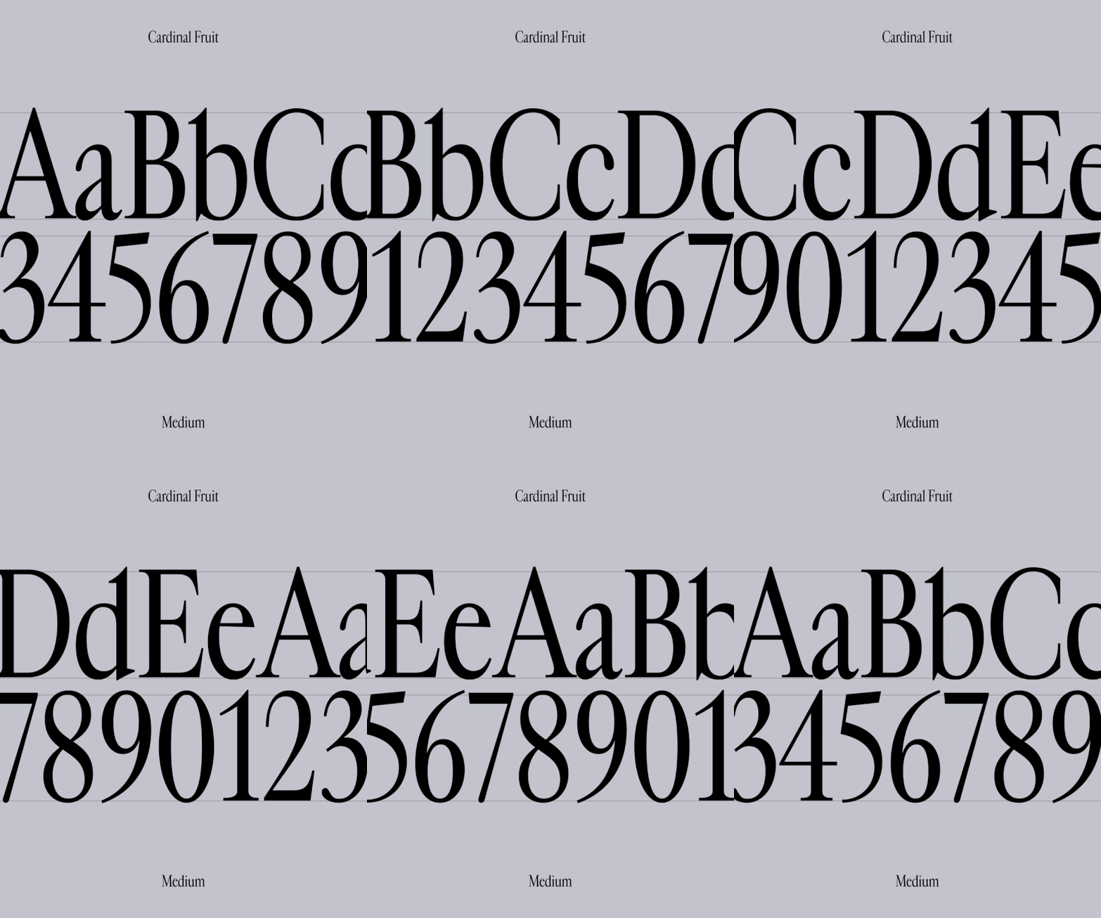
I tuned type scale, contrast, and spacing for the primary audience, not for a design award. Every interactive element is large, obvious, and forgiving.
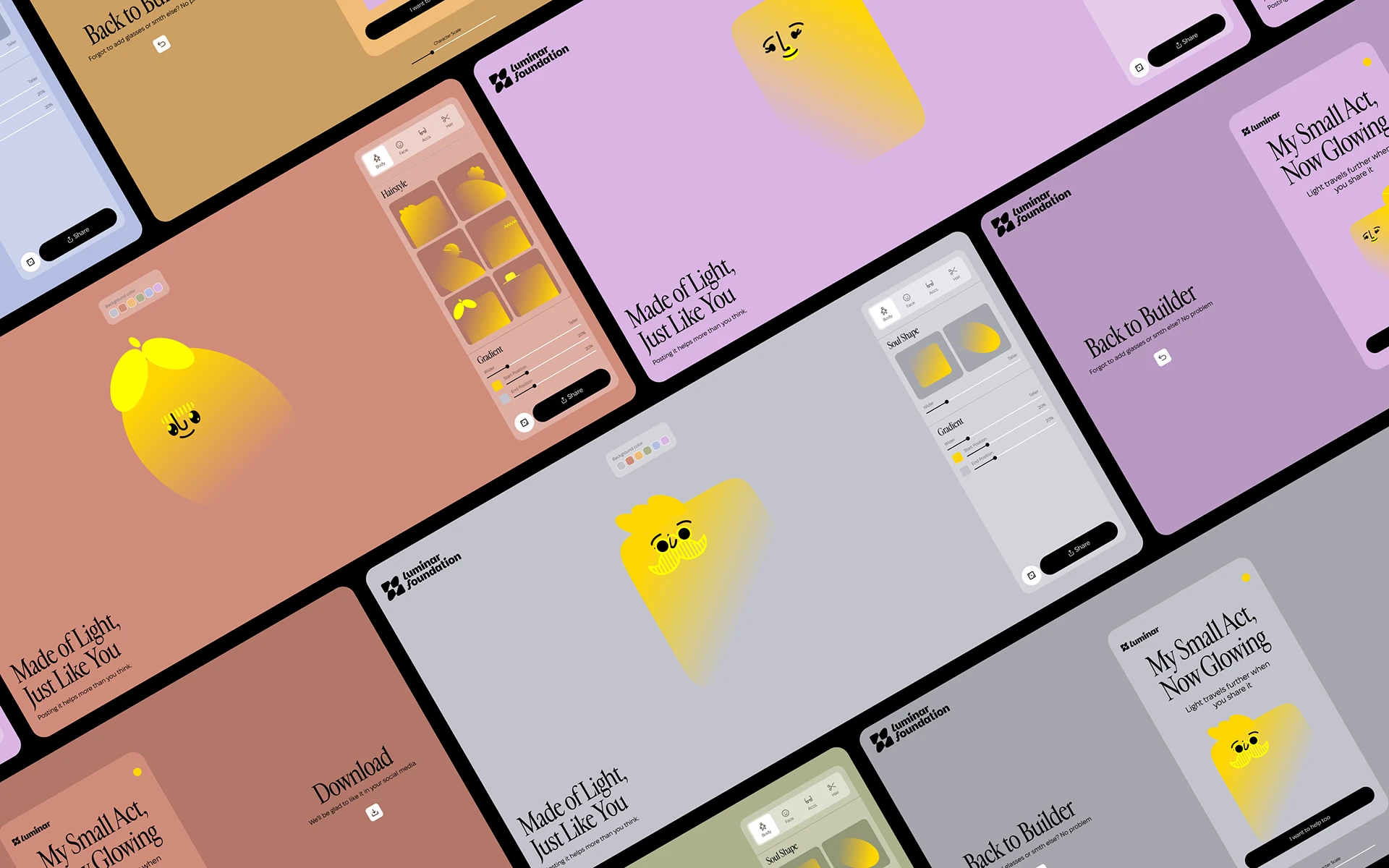
Light as the interaction layer
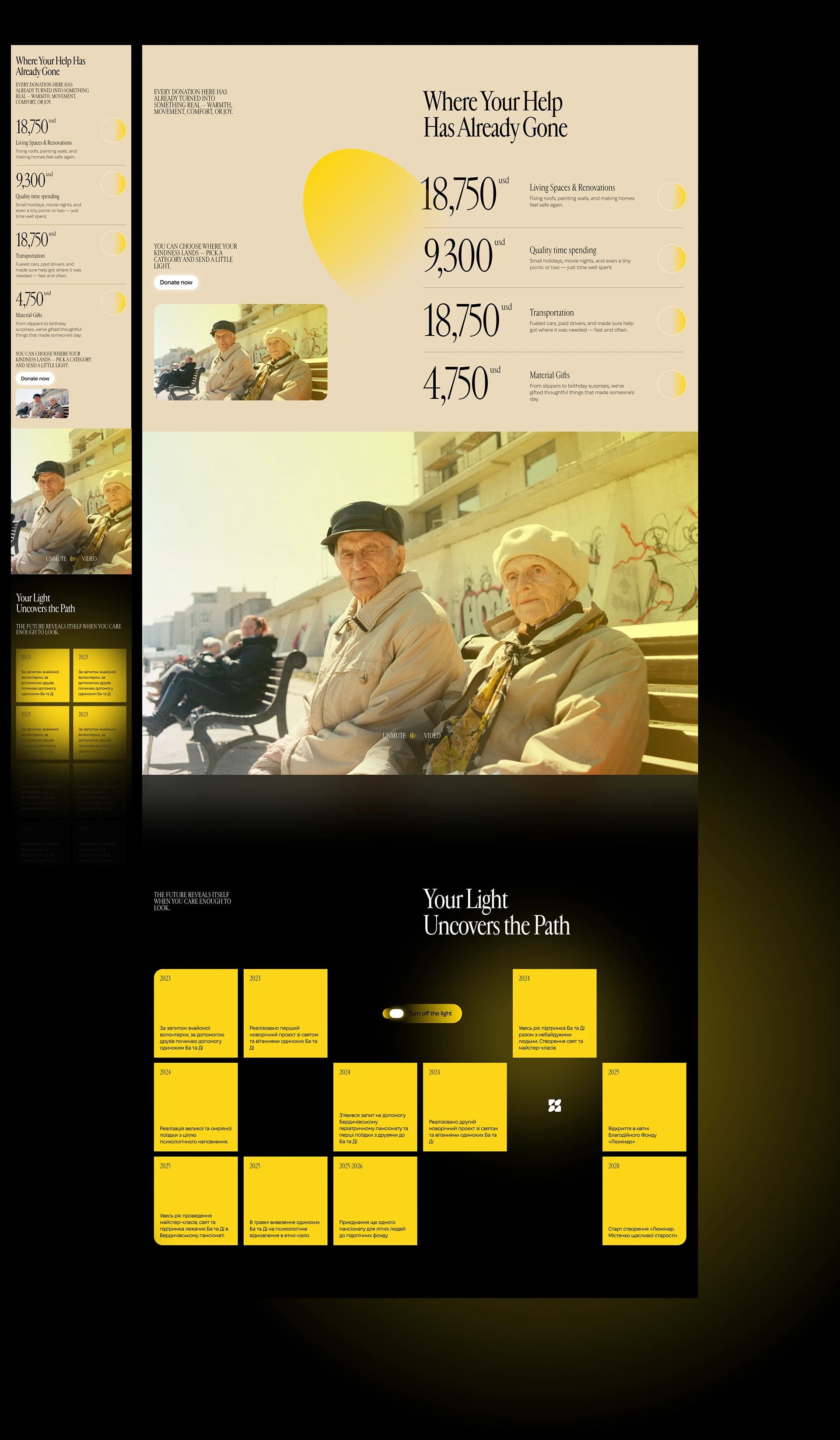
I turned the brand idea, light, into a functional device: it highlights, reveals, and guides attention as you move, never at the cost of readability.
Transparency as a feature
A dedicated thread shows where support has already gone, turning an abstract cause into something concrete a donor can see.
Outcome
An 80-year-old and a first-time donor can both use it without friction, accessibility and warmth reinforcing each other instead of competing.