Genie · A quick digital concept for healthcare
My role: Design Director (Product) — shaped the app around the concept and held it to healthcare UX standards.
Genie Health is an AI health guide — it pulls scattered health data into one place and tells you what matters now. This is the product side of a fast concept: how to make a health app, the kind people usually avoid, feel worth opening.
The idea
Genie had a working app and a flat one — healthcare blue-and-green and a nameless AI blob, screens that delivered information without ever suggesting who was delivering it. In a category people already avoid, how the app feels decides whether they open it at all.
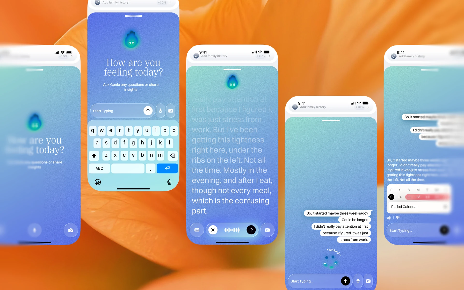
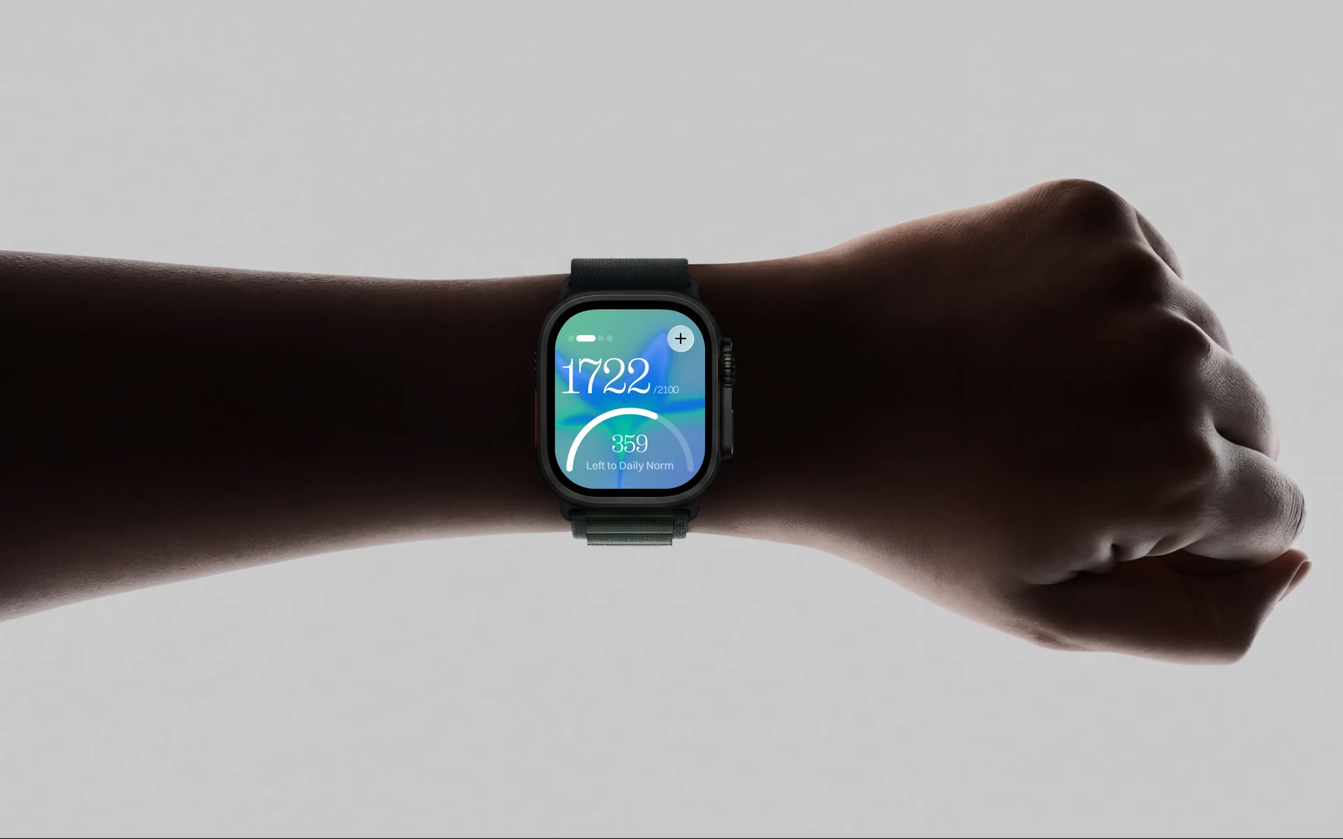
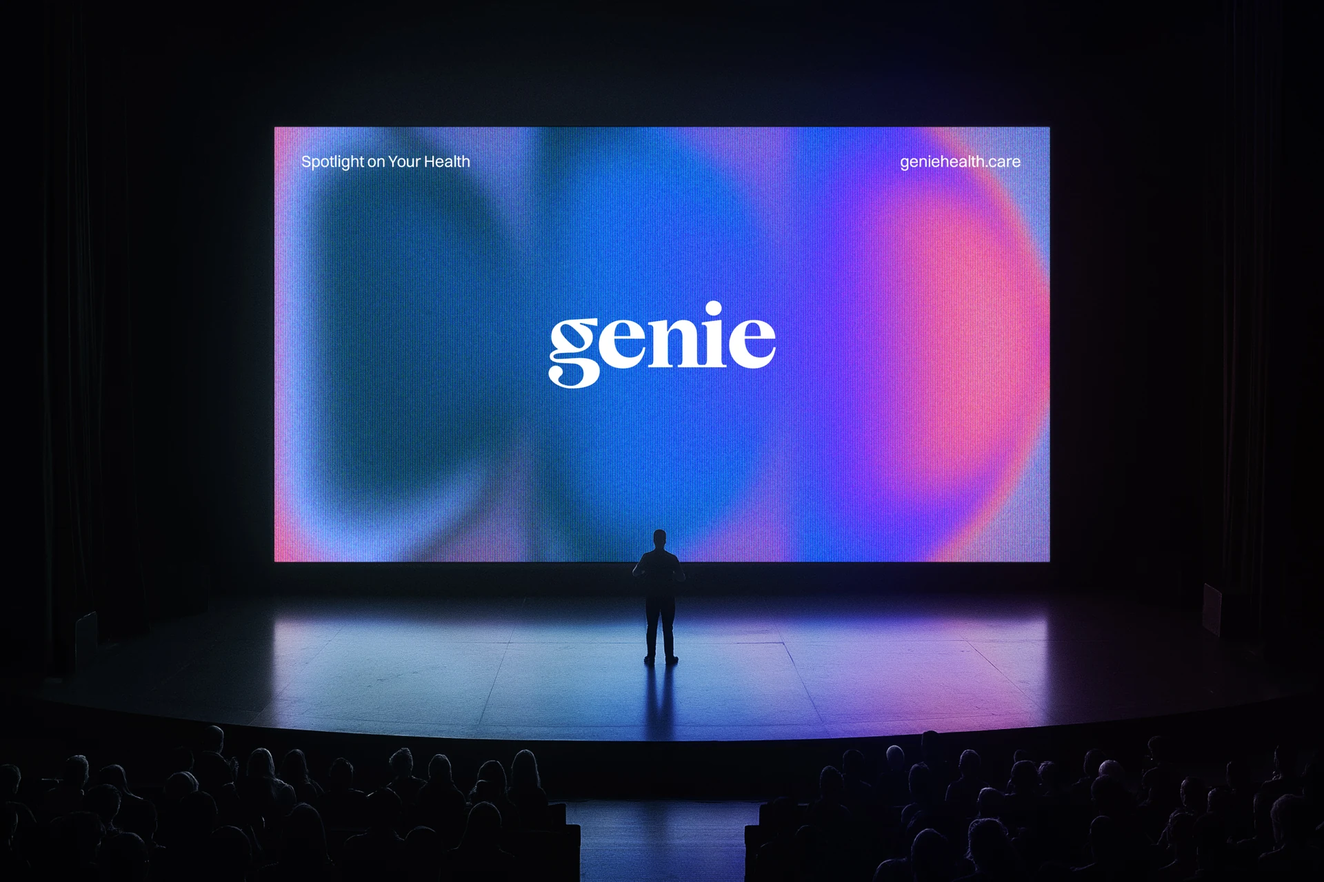
The concept was a spotlight: show what matters for you right now, and leave the rest in the dark until you need it. I shaped the product around that — the home surfaces one thing at a time, and the gradients shape themselves around the data they show, so the interface carries the same idea as the brand.
A character you’d actually talk to
Most AI assistants are an abstract glowing sphere. Genie’s became a flame — warmth, energy, the folklore of the name — with moods: it nudges, reassures, rests, and thinks, each state shifting colour and shape. It gives a health app a face without getting in the way of the data.
Healthcare-grade underneath
Expressive on the surface, boringly reliable underneath. Type, contrast, and hierarchy hold to healthcare standards; the character even has a simplified “mini Genie” so it stays legible and high-contrast at small sizes. A health product earns trust through clarity, not decoration — the concept had to be fun to use and still easy to read.